Sports symbols Page #16
This page lists all the various symbols in the Sports symbols category.
Symbols team logos and popular crests used in all kind of sports.
Symbols in this category:
New Jersey Devils Logo
The New Jersey Devils are a professional ice hockey team based in Newark, New Jersey, that competes in the National Hockey League (NHL). The team is a member of the league's Metropolitan Division of the Eastern Conference. The club was founded as the Kansas City Scouts in Kansas City, Missouri, in 1974. The Scouts moved to Denver, Colorado in 1976 and became the Colorado Rockies. In 1982, they moved to East Rutherford, New Jersey and took their current name. For their first 25 seasons in New Jersey, the Devils were based at the Meadowlands Sports Complex in East Rutherford and played their home games at Brendan Byrne Arena (later renamed to Continental Airlines Arena). Beginning with the 2007–08 season, the Devils relocated to Newark and now play their home games at the Prudential Center.
New Orleans Pelicans Logo
The New Orleans Hornets were sold to Tom Benson on April 13, 2012.
After purchasing the team, Benson indicated that he wanted to change the club's nickname to something more regionally appropriate. On December 14, 2012, it was reported that the Hornets would change their nickname to the New Orleans Pelicans.
On January 24, 2013, the team held a press conference, where it unveiled its new nickname, logos and colors. The name Pelicans is a reference to the brown pelican, the state bird of Louisiana. The team said in a press release that its colors would be navy, gold and red; each color is represented in the city flag of New Orleans.
The team formally adopted its new brand identity at the end of the 2012–13 NBA season.
New Orleans Saints Logo
Black, along with old gold and white, has always been one of the team colors, but it wasn't the first choice of original majority owner John W. Mecom, Jr. His preference was for Mecom blue, a medium shade which was used by all of his other investments. The NFL office, however, informed him that his proposed combination too closely resembled that worn by the San Diego Chargers. Although the Chargers were members of the AFL, the older league didn't want to offend its soon-to-be partner so soon after the merger. Mecom settled on black as the primary color as a nod to his financial involvement in the petroleum industry. "Black gold" is a term synonymous with oil. Although the Pittsburgh Steelers—who played a few home games in New Orleans during their early years to avoid conflict with the Pittsburgh Panthers football team—have long used black and gold as their colors, their shade of gold more closely resembles yellow, making the Saints black and gold compatible with the rest of the NFL.
New York City FC Logo
New York City Football Club is an American professional soccer club based in New York City that competes as a member of the Eastern Conference in Major League Soccer (MLS). NYCFC began play in 2015, as an expansion team of the league. The club is the first MLS franchise based in the city, and the second franchise in the New York metropolitan area after the New York Red Bulls, based in Harrison, New Jersey.
New York Giants Logo
With over 80 years of team history, the Giants have used numerous uniforms and logos, while maintaining a consistent identity. The Giants' logos include several incarnations of a giant quarterback preparing to throw a football, a lowercase "ny", and stylized versions of the team nickname.
New York Islanders Logo
An advertising executive, John Alogna, created the original version of the Islanders logo with the NY over a silhouette of part of Long Island: Nassau and Suffolk counties. Part of the Y is made to resemble a hockey stick, with three orange stripes near the bottom of the shaft and a puck located to the right of the stick blade. At the bottom of the logo, the name of the team is written so that the tip of the "I" ends in a point aimed at Uniondale, Nassau County, the location of the Nassau Coliseum. The Islanders later updated the stripes, adding a fourth to represent the four Stanley Cups won by the franchise. Aside from the 1995 rebrand attempt, this logo has remained largely intact throughout the team's history.
New York Jets Logo
The Jets' colors are hunter green and white. The team's current uniform and primary logo, in use since 1998, are modernized versions of the design used from 1965-77. The helmet is white with two parallel green stripes down the center, and a green facemask. The primary logo, which appears on each side of the helmet and on the jersey front by the player's left shoulder, is a green oval with the word "JETS" in thick white sans-serif italics over "NY" in outline serif lettering, and a white miniature football graphic at bottom center. The jerseys have standard one-color block numerals and serif lettering, alternating stripes on the shoulders, and opposite-colored sleeves and TV numerals. The team uses both white pants with two parallel green stripes from hip to knee on each side, and green pants with white stripes.
New York Mets Logo
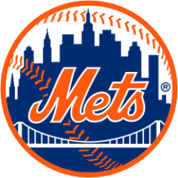
The cap logo is identical to the logo used by the New York Giants in their final years, and is on a blue cap reminiscent of the caps worn by the Brooklyn Dodgers. In the primary logo, designed by sports cartoonist Ray Gatto, each part of the skyline has special meaning—at the left is a church spire, symbolic of Brooklyn, the borough of churches; the second building from the left is the Williamsburgh Savings Bank, the tallest building in Brooklyn; next is the Woolworth Building; after a general skyline view of midtown comes the Empire State Building; at the far right is the United Nations Building. The bridge in the center symbolizes that the Mets, by bringing National League baseball back to New York, represent all five boroughs.
New York Rangers Logo
During the tenure of General Manager John Ferguson, Sr., he sought to modernize the Rangers sweater by featuring rounded numbers, a darker shade of blue and the shield logo, which was unveiled in the 1976–77 season. A blue and red stripe (white and red stripe in the blue sweaters) extend from the yoke to the sleeves, while blue pants were used. However, it proved unpopular with the fans, and following the 1977–78 season it was replaced by an updated version of their classic uniforms. Ferguson used this similar design when he became GM of the original Winnipeg Jets.
The modernized classic uniforms introduced in 1978 featured some subtle changes. Both jerseys featured a V-neck collar in a red-white-red pattern, and bolder stripes on the sleeves and waistline. On the blue jersey, the red and white stripes were separated by thin blue stripes, and the waistline stripes were raised above the hemline, so that the patterns on both jerseys matched. From 1978 to 1987, the blue jersey (then the
New York Red Bulls Logo
The New York Red Bulls are an American professional soccer team based in Harrison, New Jersey. The team competes as a member of the Eastern Conference in Major League Soccer (MLS). The Red Bulls began play in 1996, (originally known as the New York/New Jersey MetroStars), as one of the charter clubs of the league. In 2006 the team was sold to Red Bull GmbH, leading to the team's current name.The team is one of two MLS franchises representing New York, along with New York City FC.
The Red Bulls won the Supporters' Shield in 2013 and 2015. The team's prior best result in an MLS season was reaching the MLS Cup final in 2008. In the Lamar Hunt U.S. Open Cup, the MetroStars reached three semi-finals (1997, 1998, 2000), before reaching their first final in 2003, losing 1–0 to the Chicago Fire.
Citation
Use the citation below to add this symbols category to your bibliography:
Style:MLAChicagoAPA
"Sports symbols." Symbols.com. STANDS4 LLC, 2024. Web. 27 Apr. 2024. <https://www.symbols.com/category/56/Sports+symbols>.
Have a discussion about the Sports symbols category with the community:
Report Comment
We're doing our best to make sure our content is useful, accurate and safe.
If by any chance you spot an inappropriate comment while navigating through our website please use this form to let us know, and we'll take care of it shortly.
Attachment
You need to be logged in to favorite.
Log In