What's the meaning of the New York Rangers Logo »
New York Rangers Logo
This page is about the meaning, origin and characteristic of the symbol, emblem, seal, sign, logo or flag: New York Rangers Logo.
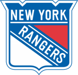
During the tenure of General Manager John Ferguson, Sr., he sought to modernize the Rangers sweater by featuring rounded numbers, a darker shade of blue and the shield logo, which was unveiled in the 1976–77 season. A blue and red stripe (white and red stripe in the blue sweaters) extend from the yoke to the sleeves, while blue pants were used. However, it proved unpopular with the fans, and following the 1977–78 season it was replaced by an updated version of their classic uniforms. Ferguson used this similar design when he became GM of the original Winnipeg Jets.
The modernized classic uniforms introduced in 1978 featured some subtle changes. Both jerseys featured a V-neck collar in a red-white-red pattern, and bolder stripes on the sleeves and waistline. On the blue jersey, the red and white stripes were separated by thin blue stripes, and the waistline stripes were raised above the hemline, so that the patterns on both jerseys matched. From 1978 to 1987, the blue jersey (then the
During the tenure of General Manager John Ferguson, Sr., he sought to modernize the Rangers sweater by featuring rounded numbers, a darker shade of blue and the shield logo, which was unveiled in the 1976–77 season. A blue and red stripe (white and red stripe in the blue sweaters) extend from the yoke to the sleeves, while blue pants were used. However, it proved unpopular with the fans, and following the 1977–78 season it was replaced by an updated version of their classic uniforms. Ferguson used this similar design when he became GM of the original Winnipeg Jets.
The modernized classic uniforms introduced in 1978 featured some subtle changes. Both jerseys featured a V-neck collar in a red-white-red pattern, and bolder stripes on the sleeves and waistline. On the blue jersey, the red and white stripes were separated by thin blue stripes, and the waistline stripes were raised above the hemline, so that the patterns on both jerseys matched. From 1978 to 1987, the blue jersey (then the road jersey) featured "NEW YORK" diagonally across the front instead of the traditional "RANGERS" wordmark, similar to their current heritage alternate jerseys. In 1997, the Rangers reverted the blue jersey's design, restoring the old striping pattern, and becoming the first team to re-introduce lace-up collars. The white jerseys followed suit in 1999, and the design was carried over to the Reebok Edge template in 2007.
The Rangers currently use a heritage blue alternate jersey, which was unveiled in the 2010–11 season. The front of the sweater features the city name in a sans-serif block lettering and in red with cream trim. The inside of the collar features the franchise's foundation year while retired player numbers are added inside the sweater below the back stripes. Unlike in their regular jerseys, the script is not dropshadowed, while the player name is in cream and in a different, almost horizontal, arch form. These third jerseys are currently worn when the Rangers play home games on Saturdays or against Original Six teams.
The Rangers previously had a navy alternate jersey featuring the head of the Statue of Liberty with the team abbreviation (NYR) below in a futuristic script. Silver was used as an accent color, but the player names and numbers retain the same color schemes as the regular jerseys, except for a darker shade of blue. With the exception of a white version used in the 1998–99 season, this jersey was used from 1996 to 2007, and proved to be highly popular with fans.
In the 2012 NHL Winter Classic, the Rangers wore a cream jersey combining classic and current styles. A different version of the shield logo was used, while the player names were arranged in a straight line. The stripes were also lessened, giving it a minimalist, vintage look, as most Winter Classic jerseys are.
For the 2014 NHL Stadium Series, the Rangers used white jerseys with the city name in navy, silver and red. In addition, they feature diagonal stripes and sleeve numbers, and enlarged numbers on the back to make them more readable to spectators. The chrome version of the shield logo is placed in the left shoulder. Like the Winter Classic sweaters, player names are in a straight position.
- 784 Views
Graphical characteristics:
Asymmetric, Closed shape, Colorful, Contains both straight and curved lines, Has no crossing lines.
Category: Sports symbols.
New York Rangers Logo is part of the National Hockey League group.
More symbols in National Hockey League:
The National Hockey League (NHL; French: Ligue nationale de hockey—LNH) is a professional ice hockey league composed of 30 member clubs: 23 in the United States and 7 in Canada. Headquartered in New … read more »
More symbols in Sports symbols:
Symbols team logos and popular crests used in all kind of sports. read more »
Citation
Use the citation below to add this symbol to your bibliography:
Style:MLAChicagoAPA
"New York Rangers Logo." Symbols.com. STANDS4 LLC, 2024. Web. 26 Jul 2024. <https://www.symbols.com/symbol/new-york-rangers-logo>.





Have a discussion about New York Rangers Logo with the community:
Report Comment
We're doing our best to make sure our content is useful, accurate and safe.
If by any chance you spot an inappropriate comment while navigating through our website please use this form to let us know, and we'll take care of it shortly.
Attachment
You need to be logged in to favorite.
Log In