What's the meaning of the New York Islanders Logo »
New York Islanders Logo
This page is about the meaning, origin and characteristic of the symbol, emblem, seal, sign, logo or flag: New York Islanders Logo.
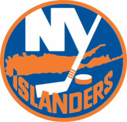
An advertising executive, John Alogna, created the original version of the Islanders logo with the NY over a silhouette of part of Long Island: Nassau and Suffolk counties. Part of the Y is made to resemble a hockey stick, with three orange stripes near the bottom of the shaft and a puck located to the right of the stick blade. At the bottom of the logo, the name of the team is written so that the tip of the "I" ends in a point aimed at Uniondale, Nassau County, the location of the Nassau Coliseum. The Islanders later updated the stripes, adding a fourth to represent the four Stanley Cups won by the franchise. Aside from the 1995 rebrand attempt, this logo has remained largely intact throughout the team's history.
Before the 1995–96 season, the Islanders attempted to update their look. The result was the unveiling of a logo depicting a fisherman holding a hockey stick. The logo was a marketing disaster; the reaction among the fan base was so negative that management announced it would revert to the original logo as soon as league rules allowed them to do so. Many fans found that the logo bore a strong resemblance to the Gorton's fisherman; indeed, New York Rangers fans taunted the Islanders with chants of "we want fishsticks" long after the logo was discarded. The traditional logo was phased back in over the next two seasons, starting as an alternate jersey logo in 1996–97 before fully replacing the fisherman in 1997–98. The only change to the classic logo at this time was its colors; as the team had replaced its original royal blue with navy, the logo was recolored to match.
Beginning in 2008, the Islanders introduced another modification to their original logo for their new third jersey. The "new" logo, once again in royal blue, now features four orange stripes on the hockey stick instead of three, representing the four consecutive Stanley Cup titles in the 1980s. This became the team's full-time logo in 2010 when the team retired their inaugural Reebok Edge uniforms.
In the 2011–12 season, the Islanders added a third jersey. This one was primarily black with the word "Islanders" written in orange on the front and numbers centered under. This also marked the second time the Islanders introduced the color gray into their uniforms, the first time since the "fisherman era."
For the 2014 NHL Stadium Series, the Islanders used a new logo with the "NY" with the hockey stick found on the team's main jersey in chrome. Beginning with the 2014-15 NHL season, the NY logo is used on the team's third jersey.
- 1,084 Views
Graphical characteristics:
Asymmetric, Closed shape, Colorful, Contains curved lines, Has no crossing lines.
Category: Sports symbols.
New York Islanders Logo is part of the National Hockey League group.
More symbols in National Hockey League:
The National Hockey League (NHL; French: Ligue nationale de hockey—LNH) is a professional ice hockey league composed of 30 member clubs: 23 in the United States and 7 in Canada. Headquartered in New … read more »
More symbols in Sports symbols:
Symbols team logos and popular crests used in all kind of sports. read more »
Citation
Use the citation below to add this symbol to your bibliography:
Style:MLAChicagoAPA
"New York Islanders Logo." Symbols.com. STANDS4 LLC, 2024. Web. 27 Jul 2024. <https://www.symbols.com/symbol/new-york-islanders-logo>.







Have a discussion about New York Islanders Logo with the community:
Report Comment
We're doing our best to make sure our content is useful, accurate and safe.
If by any chance you spot an inappropriate comment while navigating through our website please use this form to let us know, and we'll take care of it shortly.
Attachment
You need to be logged in to favorite.
Log In