Major League Baseball
This page lists of the various symbols in the Major League Baseball group.
Major League Baseball (MLB) is a professional baseball organization, the oldest of the four major professional sports leagues in the United States and Canada. A total of 30 teams now play in the American League (AL) and National League (NL), with 15 teams in each league. The AL and NL operated as separate legal entities from 1901 and 1876 respectively. After cooperating but remaining legally separate entities since 1903, the leagues merged into a single organization led by the Commissioner of Baseball in 2000. The organization also oversees Minor League Baseball, which comprises about 240 teams affiliated with the Major League clubs. With the World Baseball Softball Confederation, MLB manages the international World Baseball Classic tournament.
Symbols in this group:
Arizona Diamondbacks Logo
The Diamondbacks' original colors were purple, black, teal and copper.
Their first logo was an italicized block letter "A" with a diamond pattern, and the crossbar represented by a snake's tongue. Prior to their inaugural season, they released their baseball caps. The home cap had a cream color crown with a purple visor and button. The road cap was black and had a turquoise visor and button. Their alternate cap had a turquoise crown with a purple visor and button. Depending on the cap, the "A" logo on the front of the cap had different color variations.
Atlanta Braves Logo
From 1912 to 1989 the Braves logo consisted of the head of an Indian warrior. From 1912 to 1956 it was an Indian with a headdress, and thereafter a laughing Indian with a mohawk and one feather in his hair. In 1990 the logo was changed to just the word "Braves" in cursive with a tomahawk below it.
Baltimore Orioles Logo
The Baltimore Orioles are an American professional baseball team based in Baltimore, Maryland. The Orioles compete in Major League Baseball (MLB) as a member of the American League (AL) East division.
Boston Red Sox Logo
The primary home uniform for the Boston Red Sox is white with red piping around the neck and down either side of the front placket and "RED SOX" in red letters outlined in blue arched across the chest. This has been in use since 1979, and was previously used from 1933 to 1972, although the piping occasionally disappeared and reappeared; in between the Red Sox wore pullovers with the same "RED SOX" template. There are red numbers, but no player name, on the back of the home uniform.
Chicago White Sox Logo
Over the years the White Sox have become noted for many of their uniform innovations and changes. In 1960, the White Sox became the first team in the major sports to put players' last names on jerseys.
In 1912 the White Sox debuted one of the most enduring and famous logos in baseball—a large "S" in a Roman-style font, with a small "O" inside the top loop of the "S" and a small "X" inside the bottom loop. This is the logo associated with the 1917 World Series championship team and the 1919 Black Sox. With a couple of brief interruptions, the dark-blue logo with the large "S" lasted through 1938 (but continued in a modified block style into the 1940s). Through the 1940s, the White Sox team colors were primarily navy blue trimmed with red.
The White Sox logo in the 1950s and 1960s (actually beginning in the 1949 season) was the word "SOX" in an Old English font, diagonally arranged, with the "S" larger than the other two letters. From 1949 through 1963, the primary color was black (tri
Cincinnati Reds Logo
Throughout the history of the Cincinnati Reds, many different variations of the classic wishbone "C" logo have been introduced. For most of the history of the Reds, especially during the early history, the Reds logo has been simply the wishbone "C" with the word "REDS" inside, the only colors used being red and white. However, during the 1950s, during the renaming and re-branding of the team as the Cincinnati Redlegs because of the connections to communism of the word 'Reds', the color blue was introduced as part of the Reds color combination.
During the 1960s and 1970s the Reds saw a move towards the more traditional colors, abandoning the navy blue. A new logo also appeared with the new era of baseball in 1972, when the team went away from the script "REDS" inside of the "C", instead, putting their mascot Mr. Redlegs in its place as well as putting the name of the team inside of the wishbone "C". In the 1990s the more traditional, early logos of Reds came back with the current logo r
Cleveland Indians Logo
The Indians' home uniform is white with navy piping around each sleeve. Across the front of the jersey in script font is the word "Indians" in red with a navy outline. The jersey has the Chief Wahoo logo on the left sleeve. The home cap is navy blue with a red bill and features the Chief Wahoo logo on the front. Beginning with the 2016 season, the Indians returned to their 1994–2002 practice of wearing red shirts, belts, and socks with their home uniforms, having worn navy with the home uniform from 2003–2015.
Detroit Tigers Logo
The Tigers have worn essentially the same home uniform since 1934 — solid white jersey with navy blue piping down the front and an Old English "D" on the left chest, white pants, navy blue hat with a white letter D in the blackletter or textur/textualis typeface associated with Middle and Early Modern English and popularly referred to as "Old English" even though it was not used for that language. When the Tigers are the visiting team, the D on their hats is orange and the word "DETROIT" appears across the shirt. A version of the team's blackletter D was first seen on Tigers uniforms in 1904, after using a simple block D in 1903. The blackletter D appeared frequently after that until being established in 1934. In 1960, the Tigers changed their uniform to read "Tigers", but the change only lasted one season before the traditional uniform was reinstated.
Los Angeles Angels of Anaheim Logo
The Los Angeles Angels of Anaheim have used ten different logos and three different color combinations throughout their history. Their first two logos depict a baseball with wings and a halo over a baseball diamond with the letters "L" and "A" over it in different styles. The original team colors were the predominantly blue with a red trim. This color scheme would be in effect for most of the franchise's history lasting from 1961 to 1996.
In 1966, after the club's move to Anaheim, the team name changed from the "Los Angeles Angels" to the "California Angels", along with the name change, the logo changed as well. During the 31 years of being known as the "California Angels", the team kept the previous color scheme, however, their logo did change six times during this period. The first logo under this name was very similar to the previous "LA" logo, the only difference was instead of an interlocking "LA", there was an interlocking "CA." Directly after this from 1971 to 1985, the Angels
Los Angeles Dodgers Logo
The Dodgers' primary logo is modified for the 2012 season, with a thicker baseball and flight lines and a slightly-altered script.
Los Angeles Dodgers Logo
Throughout the team's history, the San Diego Padres have used six different logos and four different color combinations. The original team colors were brown and gold. Their first logo depicts a friar swinging a bat with Padres written at the top while standing in a sun-like figure with San Diego Padres on the exterior of it. The "Swinging Friar" has popped up on the uniform on and off ever since (he is currently on the left sleeve of the navy alternate jersey) although the head of the friar has been tweaked from the original in recent years, and it is currently the mascot of the team.
In 1985, the Padres switched to using a script-like logo in which Padres was written sloped up. That would later become a script logo for the Padres. The team's colors were changed to brown and orange and remained this way through the 1990 season.
Milwaukee Brewers Logo
The first Brewers uniforms were "hand-me-downs" from the Seattle Pilots. Because the move to Milwaukee received final approval less than a week before the start of the season, there was no time to order new uniforms. Selig had originally planned to change the Brewers' colors to navy blue and red in honor of the minor league American Association's Milwaukee Brewers, but was forced to simply remove the Seattle markings from the Pilots' blue-and-gold uniforms and sew "BREWERS" on the front. However, the outline of the Pilots' logo remained visible. The uniforms had unique striping on the sleeves left over from the Pilots days. The cap was an updated version of the Milwaukee Braves cap in blue and yellow. Ultimately, it was decided to keep blue and gold as the team colors, and they have remained so ever since.
The Brewers finally got their own flannel design in 1971. This design was essentially the same as the one used in 1970, but with blue and yellow piping on the sleeves and collar. In
Minnesota Twins Logo
The name "Twins" was derived from the popular name of the region, the Twin Cities. The NBA's Minneapolis Lakers had re-located to Los Angeles in 1960 due to poor attendance which was believed to have been caused in part by the reluctance of fans in St. Paul to support the team.
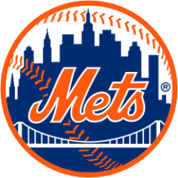
New York Mets Logo
The cap logo is identical to the logo used by the New York Giants in their final years, and is on a blue cap reminiscent of the caps worn by the Brooklyn Dodgers. In the primary logo, designed by sports cartoonist Ray Gatto, each part of the skyline has special meaning—at the left is a church spire, symbolic of Brooklyn, the borough of churches; the second building from the left is the Williamsburgh Savings Bank, the tallest building in Brooklyn; next is the Woolworth Building; after a general skyline view of midtown comes the Empire State Building; at the far right is the United Nations Building. The bridge in the center symbolizes that the Mets, by bringing National League baseball back to New York, represent all five boroughs.
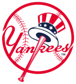
New York Yankees Logo
Throughout much of their tenure as the Highlanders, the logo was variations of a stylized N and Y, which lay separately on either side of the jersey's breast. In 1905, the two locked for one season, but not in the way used today. It wasn't until 1909 that the team changed to the familiar interlocking NY that would be the team logo long after the team became known as the Yankees, and would continue to be the cap insignia until today. The interlocking NY was originally designed by Tiffany & Co. and struck on a medal of honor presented in 1877 to John McDowell, a NYC police officer shot in the line of duty.
The primary logo, created in 1947 by sports artist Henry Alonzo Keller, consists of "Yankees" against a baseball, written in red script with a red bat forming the vertical line of the K, an Uncle Sam hat hanging from the barrel. The logo was slightly changed over the years, with the current version first appearing in the 1970s.
The interlocking NY has varied greatly, and there are
Oakland Athletics Logo
From 1994 until 2013, the A's wore green alternates jerseys with the word "Athletics" in gold. It was used on both road and home games. During the 2000s, the Athletics introduced black as one of their colors. They began wearing a black alternate jersey with "Athletics" written in green. After a brief discontinuance, the A's brought back the black jersey, this time with "Athletics" written in white with gold highlights. Commercially popular but rarely chosen as the alternate by players, in 2011 they were replaced by a new gold alternate jersey with "A's" in green on the left chest. With the exception of several road games during the 2011 season, the Athletics' gold uniforms are used as the designated home alternates. A green version of their gold alternates was introduced for the 2014 season to replace their previous green alternates. The new green alternates feature the piping, "A's" and lettering in white with gold trim.
Philadelphia Phillies Logo
The current team colors, uniform, and logo date to 1992. The main team colors are red and white, with blue serving as a prominent accent. The team name is written in red with a blue star serving as the dot over the "i"s, and blue piping is often found in Phillies branded apparel and materials. The team's home uniform is white with red pinstripes, lettering and numbering. The road uniform is traditional grey with red lettering/numbering. Both bear a script-lettered "Phillies" logo, with the aforementioned star dotting the "i"s across the chest, and the player name and number on the back. Hats are red with a single stylized "P". The uniforms and logo are very similar to those used during the "Whiz Kids" era from 1950 to 1969.
Pittsburgh Pirates Logo
The Pirates have had many uniforms and logo changes over the years, with the only consistency being the "P" on the team's cap. It was adopted in 1948. Aside from style changes in the cap itself, the "P" logo has remained since.
The Pirates have long been innovators in baseball uniforms. In 1948, the team broke away from the patriotic "Red, White, & Blue" color scheme when they adopted the current black & gold color scheme, to match that of the colors of the Flag of Pittsburgh and, to a lesser extent at the time, the colors of the then-relatively unknown Pittsburgh Steelers of the NFL. While they were not the first baseball team to do this, they were one of the first to do this permanently. Along with the San Francisco Giants, the Pirates are one of two pre-expansion National League teams that completely changed their colors, although red returned as an "accent color" in 1997 and remained until 2009.
In the late 1950s, the team adopted sleeveless jerseys. While not an innovation by th
Seattle Mariners Logo
The Mariners donned their current uniforms in 1993. White jerseys and pants are worn for most home games, while gray jerseys and pants are worn on the road. In 2011, the team brought back an alternate "Northwest Green" jersey that was previously part of the uniform set from 1994 to 1996 to be worn during Friday home games. A navy blue alternate jersey is worn for occasional road games; other variations of a navy jersey had been used as home alternates prior to the reintroduction of the Northwest Green jersey.
St. Louis Cardinals Logo
The Cardinals have had few logos throughout their history, although those logos have evolved over time. The first logo associated with the Cardinals was an interlocking "SL" that appeared on the team's caps and or sleeves as early as 1900. Those early uniforms usually featured the name "St. Louis" on white home and gray road uniforms which both had cardinal red accents. In 1920, the "SL" largely disappeared from the team's uniforms, and for the next 20 years the team wore caps that were white with red striping and a red bill.
In 1922, the Cardinals wore uniforms for the first time that featured the two familiar cardinal birds perched on a baseball bat over the name "Cardinals" with the letter "C" of the word hooked over the bat. The concept of the birds originated after general manager Branch Rickey noticed a colorful cardboard arrangement featuring cardinal birds on a table in a Presbyterian church in Ferguson, Missouri, at which he was speaking. The arrangement's production was by a
Tampa Bay Rays Logo
The current Rays primary uniform has been used with little change since the team officially shortened its name from "Devil Rays" for the 2008 season. The home jersey is a traditional white with the name "Rays" in dark blue across the chest and a yellow "sunburst" on the letter "R". The Rays' road uniform is gray, also with a sunburst and the team name across the chest. Both feature dark blue piping and caps featuring a white "TB" logo.
Citation
Use the citation below to add this symbols group page to your bibliography:
Style:MLAChicagoAPA
"Major League Baseball Symbols." Symbols.com. STANDS4 LLC, 2024. Web. 27 Jul 2024. <https://www.symbols.com/group/117/Major+League+Baseball>.



Have a discussion about the Major League Baseball group with the community:
Report Comment
We're doing our best to make sure our content is useful, accurate and safe.
If by any chance you spot an inappropriate comment while navigating through our website please use this form to let us know, and we'll take care of it shortly.
Attachment
You need to be logged in to favorite.
Log In