What's the meaning of the Minnesota Twins Logo »
Minnesota Twins Logo
This page is about the meaning, origin and characteristic of the symbol, emblem, seal, sign, logo or flag: Minnesota Twins Logo.
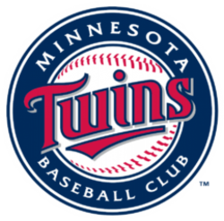
The name "Twins" was derived from the popular name of the region, the Twin Cities. The NBA's Minneapolis Lakers had re-located to Los Angeles in 1960 due to poor attendance which was believed to have been caused in part by the reluctance of fans in St. Paul to support the team.
Griffith was determined not to alienate fans in either city by naming the team after one city or the other, so his desire was to name the team the "Twin Cities Twins", however MLB objected. Griffith therefore named the team the Minnesota Twins. However, the team was allowed to keep its original "TC" (for Twin Cities) insignia for its caps. The team's logo shows two men, one in a Minneapolis Millers uniform and one in a St. Paul Saints uniform, shaking hands across the Mississippi River. The "TC" remained on the Twins' caps until 1987, when they adopted their current uniforms. By this time, the team felt it was established enough to put an "M" on its cap without having St. Paul fans think it stood for Minneapolis. The "TC" logo was moved to a sleeve on the jerseys, and occasionally appeared as an alternate cap design.
Both the "TC" and "Minnie & Paul" logos remain the team's primary insignia. As of 2010, the "TC" logo has been reinstated on the cap as their logo.
- 2,606 Views
Graphical characteristics:
Asymmetric, Closed shape, Colorful, Contains curved lines, Has no crossing lines.
Category: Sports symbols.
Minnesota Twins Logo is part of the Major League Baseball group.
More symbols in Major League Baseball:
Major League Baseball (MLB) is a professional baseball organization, the oldest of the four major professional sports leagues in the United States and Canada. A total of 30 teams now play in the Amer… read more »
More symbols in Sports symbols:
Symbols team logos and popular crests used in all kind of sports. read more »
Citation
Use the citation below to add this symbol to your bibliography:
Style:MLAChicagoAPA
"Minnesota Twins Logo." Symbols.com. STANDS4 LLC, 2024. Web. 26 Jul 2024. <https://www.symbols.com/symbol/minnesota-twins-logo>.






Have a discussion about Minnesota Twins Logo with the community:
Report Comment
We're doing our best to make sure our content is useful, accurate and safe.
If by any chance you spot an inappropriate comment while navigating through our website please use this form to let us know, and we'll take care of it shortly.
Attachment
You need to be logged in to favorite.
Log In