What's the meaning of the St. Louis Cardinals Logo »
St. Louis Cardinals Logo
This page is about the meaning, origin and characteristic of the symbol, emblem, seal, sign, logo or flag: St. Louis Cardinals Logo.
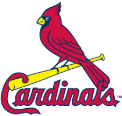
The Cardinals have had few logos throughout their history, although those logos have evolved over time. The first logo associated with the Cardinals was an interlocking "SL" that appeared on the team's caps and or sleeves as early as 1900. Those early uniforms usually featured the name "St. Louis" on white home and gray road uniforms which both had cardinal red accents. In 1920, the "SL" largely disappeared from the team's uniforms, and for the next 20 years the team wore caps that were white with red striping and a red bill.
In 1922, the Cardinals wore uniforms for the first time that featured the two familiar cardinal birds perched on a baseball bat over the name "Cardinals" with the letter "C" of the word hooked over the bat. The concept of the birds originated after general manager Branch Rickey noticed a colorful cardboard arrangement featuring cardinal birds on a table in a Presbyterian church in Ferguson, Missouri, at which he was speaking. The arrangement's production was by a
In 1956, the Cardinals changed their caps to solid blue with a red "StL", removing the red bill. Also, for that season only, the Cardinals wore a script "Cardinals" wordmark on their uniforms excluding the "birds on the bat." An updated version of the "birds on the bat" logo returned in 1957 with the word "Cardinals" written in cursive beneath the bat. In 1962, the Cardinals became the first National League team to display players' names on the back of their jerseys. In 1964, while retaining their blue caps for road games, the Cardinals changed their home caps to all red with a white interlocking "StL". The next year, they changed their road caps to red as well. In 1967, the birds on the bat emblem on the jersey was again tweaked, making the birds more realistic and changing the position of their tails relative to the bat and this version remained on all Cardinals game jerseys through 1997.
In 1971, following the trend in baseball at the time, the Cardinals replaced the traditional flannel front-button shirts and pants with belts with new pullover knit jerseys and elastic waist pants. Another trend in baseball led the Cardinals to change their road uniforms from gray to light blue from 1976–1984. In 1992, the Cardinals returned to wearing traditional button-down shirts and pants with belts. That same year they also began wearing an all-navy cap with a red "StL" on the road only while wearing the same red and white cap at home games. In 1998, the "birds on the bat" was updated for the first time in 30 years with more detailed birds and bolder letters. That year, St. Louis introduced a cap featuring a single cardinal bird perched on a bat worn only on Sunday home games. The new birds on the bat design was modified again the next year, with yellow beaks and white eyes replacing the red beaks and yellow eyes of the 1998 version. Uniform numbers also returned to the front of the jerseys in 1999 after a two-year absence.
On November 16, 2012, the Cardinals unveiled a new alternate uniform to be worn at home games on Saturdays beginning with the 2013 season.[needs update] The modified jersey, cream-colored with red trim on the sleeves and down the front, was the first since 1932 in which "St. Louis" will be used instead of "Cardinals" and retained the "birds on the bat."
2013 also saw the team adopt their red caps as their main uniform for both home and away games; the navy cap was retained as an alternate, used mainly against other red-capped teams. Over the years, the Cardinals have released various marketing logos depicting anthropomorphized cardinals in a pitching stance, swinging a baseball bat, or wearing a baseball cap that never became part of the game uniform.
- 1,333 Views
Graphical characteristics:
Open shape, Colorful, Contains curved lines, Has no crossing lines.
Category: Sports symbols.
St. Louis Cardinals Logo is part of the Major League Baseball group.

More symbols in Major League Baseball:
Major League Baseball (MLB) is a professional baseball organization, the oldest of the four major professional sports leagues in the United States and Canada. A total of 30 teams now play in the Amer… read more »
More symbols in Sports symbols:
Symbols team logos and popular crests used in all kind of sports. read more »
Citation
Use the citation below to add this symbol to your bibliography:
Style:MLAChicagoAPA
"St. Louis Cardinals Logo." Symbols.com. STANDS4 LLC, 2024. Web. 27 Jul 2024. <https://www.symbols.com/symbol/st.-louis-cardinals-logo>.








Have a discussion about St. Louis Cardinals Logo with the community:
Report Comment
We're doing our best to make sure our content is useful, accurate and safe.
If by any chance you spot an inappropriate comment while navigating through our website please use this form to let us know, and we'll take care of it shortly.
Attachment
You need to be logged in to favorite.
Log In