What's the meaning of the Chicago Fire Soccer Club Logo »
Chicago Fire Soccer Club Logo
This page is about the meaning, origin and characteristic of the symbol, emblem, seal, sign, logo or flag: Chicago Fire Soccer Club Logo.
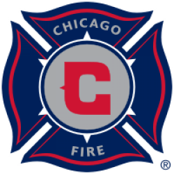
Chicago Fire Soccer Club is an American professional soccer club based in the Chicago suburb of Bridgeview, Illinois, United States. The team competes in Major League Soccer (MLS) as a member of the Eastern Conference of the league. The franchise is named after the Great Chicago Fire of 1871, and was founded on October 8, 1997, the event's 126th anniversary. The team began play in 1998 as one of the league's first expansion teams. The Fire won the MLS Cup as well as the U.S. Open Cup (the "double") on their first season. They have also won U.S. Open Cups in 2000, 2003, and 2006; in addition to the 2003 MLS Supporters' Shield.
The Fire maintains an extensive development system, consisting of the Chicago Fire U-23 (Premier Development League and Super-20 League teams), the Chicago Fire Development Academy, and the Chicago Fire Juniors youth organization. They also operate the Chicago Fire Foundation, the team's community-based charitable division. Toyota Park is the Fire's home stadium.
The official club colors are red and white. Over its history, the Fire have also employed navy blue, sky blue, and black as alternate colors.
The Chicago Fire logo is derived from the standard shape of a fire department's crest (also shown by the Chicago Fire Department), also known as a Florian's cross. This style was chosen by the original general manager, Peter Wilt, to establish a timeless image evocative of both classic American sports (as in the logos of the NHL Original Six) and the traditions of European soccer.
The logo features a stylized 'C' at its heart (representing Chicago), similar to the logos of the Bears and Cubs. The six points in a ring around the center allude to the stars in the Municipal Flag of Chicago, specifically the one commemorating the Great Chicago Fire of 1871.
Nike, the Fire's original equipment supplier, intended for the team to be named the Chicago Rhythm. The Rhythm identity featured a turquoise, black and green color scheme, and a logo adorned with a cobra. Team officials ignored Nike's work, and privately developed the Fire identity with the help of Adrenalin, Inc., a well-known sports-specific branding agency.
- 627 Views
Graphical characteristics:
Asymmetric, Closed shape, Colorful, Contains curved lines, Has no crossing lines.
Category: Sports symbols.
Chicago Fire Soccer Club Logo is part of the Major League Soccer group.
More symbols in Major League Soccer:
Major League Soccer (MLS) is a men's professional soccer league, sanctioned by U.S. Soccer, that represents the sport's highest level in both the United States and Canada. MLS constitutes o… read more »
More symbols in Sports symbols:
Symbols team logos and popular crests used in all kind of sports. read more »
Citation
Use the citation below to add this symbol to your bibliography:
Style:MLAChicagoAPA
"Chicago Fire Soccer Club Logo." Symbols.com. STANDS4 LLC, 2024. Web. 27 Jul 2024. <https://www.symbols.com/symbol/chicago-fire-soccer-club-logo>.



Have a discussion about Chicago Fire Soccer Club Logo with the community:
Report Comment
We're doing our best to make sure our content is useful, accurate and safe.
If by any chance you spot an inappropriate comment while navigating through our website please use this form to let us know, and we'll take care of it shortly.
Attachment
You need to be logged in to favorite.
Log In