What's the meaning of the Sacramento Kings Logo »
Sacramento Kings Logo
This page is about the meaning, origin and characteristic of the symbol, emblem, seal, sign, logo or flag: Sacramento Kings Logo.
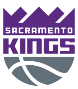
In 1994, the Kings radically changed their look, adopting a new color scheme of purple, silver, black and white.
The uniform set consists of one wide side stripe running through the right leg of the shorts, with the primary Kings logo prominently featured. The home uniform is in white, while the road uniform is in black (by later coincidence, the NHL's Los Angeles Kings would use that exact color scheme). From 1994 to 1997, a half-purple, half-black uniform, featuring checkerboard side panels, was used as an alternate uniform, which was panned by fans. However, the uniform was revived for the 2012–13 season during Hardwood Classics Nights. A new purple uniform, which shares the same template from the home and road uniforms, was introduced in the 1997–98 season.
Before the start of the 2002–03 NBA season, the Kings changed their uniforms once again. This set included a modernized version of the "Kings" script on the home jersey, and the city name on the purple road jersey. The side st
For the 2014–15 season, the Kings made a few tweaks to their home and away uniforms. While the team kept the 2008-era template, they brought back the 1994–2002 "Kings" script from the primary logo on both uniforms, along with purple (home) and white (away) numbers. The black alternate uniform was kept without any alterations. In addition, the crown logo at the back was replaced by the NBA logo, while a gold tab above it represents the franchise's 1951 NBA championship. The team announced it would wear an updated version of the powder blue 1985–90 uniforms 10 times during the season, including at the last home game at Sleep Train Arena, April 9 vs. the Oklahoma City Thunder.
For the 2016–17 season, the Kings are changing their brand once more, adopting a logo reminiscent of their 1971–1994 design and dispatching of the black from their logo while keeping the purple and silver. The Kings unveiled their new uniforms on June 15, 2016, featuring four different designs. Both the home white and purple away uniforms feature a modernized "Kings" script, an updated crown on top, and gray side stripes. The so-called 'City' uniforms are similar to the away uniforms, except that the abbreviation "SAC" in gray appears in front. The black 'Global' uniforms substitute the crown for a standing lion crest on top, along with a solid gray side stripe on the right and the primary logo on the left leg. All uniforms feature a baby blue collar, stitches, and tab that says "Sacramento Proud", a nod to the franchise's first few seasons in Sacramento.
- 633 Views
Graphical characteristics:
Asymmetric, Closed shape, Colorful, Contains curved lines, Has no crossing lines.
Category: Sports symbols.
Sacramento Kings Logo is part of the National Basketball Association Logos group.
More symbols in National Basketball Association Logos:
The National Basketball Association (NBA) was established on June 6, 1946 and originally known as the Basketball Association of American (BAA). Of the original 11 franchises in that inaugural season … read more »
More symbols in Sports symbols:
Symbols team logos and popular crests used in all kind of sports. read more »
Citation
Use the citation below to add this symbol to your bibliography:
Style:MLAChicagoAPA
"Sacramento Kings Logo." Symbols.com. STANDS4 LLC, 2024. Web. 27 Jul 2024. <https://www.symbols.com/symbol/sacramento-kings-logo>.



Have a discussion about Sacramento Kings Logo with the community:
Report Comment
We're doing our best to make sure our content is useful, accurate and safe.
If by any chance you spot an inappropriate comment while navigating through our website please use this form to let us know, and we'll take care of it shortly.
Attachment
You need to be logged in to favorite.
Log In