What's the meaning of the Oakland Raiders Logo »
Oakland Raiders Logo
This page is about the meaning, origin and characteristic of the symbol, emblem, seal, sign, logo or flag: Oakland Raiders Logo.
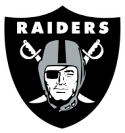
When the team was founded in 1960, a "name the team" contest was held by the Oakland Tribune. The winning name was the Oakland Señors. After a few days of being the butt of local jokes (and accusations that the contest was fixed, as Chet Soda was fairly well known within the Oakland business community for calling his acquaintances "señor"), the fledgling team (and its owners) changed the team's name nine days later to the Oakland Raiders, which had finished third in the naming contest. The original team colors were black, gold and white. The now–familiar team emblem of a pirate (or "raider") wearing a football helmet was created, reportedly a rendition of actor Randolph Scott.
The original Raiders uniforms were black and gold, while the helmets were black with a white stripe and no logo. The team wore this design from 1960 to 1962. When Al Davis became head coach and general manager in 1963, he changed the team's color scheme to silver and black, and added a logo to the helmet. This
The Raiders' current silver and black uniform design has essentially remained the same since it debuted in 1963. It consists of silver helmets, silver pants, and either black or white jerseys. The black jerseys have silver lettering names and numbers, while the white jerseys have black lettering names and numbers with silver outlining the numbers only. Originally, the white jerseys had black letters for the names and silver numbers with a thick black outline, but they were changed to black with a silver outline for the 1964 season. In 1970, the team used silver numerals with black outline and black lettering names for the season. However, in 1971 the team again displayed black numerals and have stayed that way ever since (with the exception of the 1994 season as part of the NFL's 75th Anniversary where they donned the 1963 helmets with the 1970 silver away numbers and black lettering names).
The Raiders wore their white jerseys at home for the first time in their history on September 28, 2008 against the San Diego Chargers. The decision was made by Lane Kiffin, who was coaching his final game for the Raiders, and was purportedly due to intense heat.The high temperature in Oakland that day was 78°.
For the 2009 season, the Raiders took part in the AFL Legacy Program and wore 1960s throwback jerseys for games against other teams from the former AFL.
In the 2012 and 2013 seasons, the team wore black cleats as a tribute to Al Davis. However, the team reverted to white cleats in 2014.
- 1,670 Views
Graphical characteristics:
Asymmetric, Closed shape, Colorful, Contains curved lines, Has crossing lines.
Category: Sports symbols.
Oakland Raiders Logo is part of the National Football League group.

More symbols in National Football League:
The National Football League (NFL) is a professional American football league consisting of 32 teams, divided equally between the National Football Conference (NFC) and the American Football Conferen… read more »
More symbols in Sports symbols:
Symbols team logos and popular crests used in all kind of sports. read more »
Citation
Use the citation below to add this symbol to your bibliography:
Style:MLAChicagoAPA
"Oakland Raiders Logo." Symbols.com. STANDS4 LLC, 2024. Web. 26 Jul 2024. <https://www.symbols.com/symbol/oakland-raiders-logo>.










Have a discussion about Oakland Raiders Logo with the community:
Report Comment
We're doing our best to make sure our content is useful, accurate and safe.
If by any chance you spot an inappropriate comment while navigating through our website please use this form to let us know, and we'll take care of it shortly.
Attachment
You need to be logged in to favorite.
Log In