What's the meaning of the Columbus Blue Jackets Logo »
Columbus Blue Jackets Logo
This page is about the meaning, origin and characteristic of the symbol, emblem, seal, sign, logo or flag: Columbus Blue Jackets Logo.
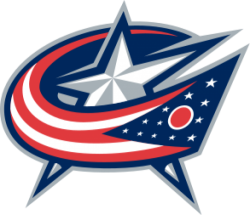
The Columbus Blue Jackets are an American professional ice hockey team based in Columbus, Ohio, that competes in the National Hockey League (NHL). They are members of the league's Metropolitan Division of the Eastern Conference.
The Blue Jackets were founded as an expansion team in 2000.The team qualified for the Stanley Cup playoffs for the first time in 2009.
The Blue Jackets' name and logos were inspired by Ohio's Civil War history. The Blue Jackets play their home games at Nationwide Arena in downtown Columbus, which opened in 2000. They are affiliated with the Cleveland Monsters of the AHL.
The team logo is a stylized version of the flag of Ohio, which is a burgee (i.e. swallowtail pennant), in the form of a "C" wrapped around a star, representing both patriotism and Columbus' status as state capital. Previously used as an alternate logo starting in 2003, it became the primary logo as part of a Reebok-sponsored redesign for the 2007–08 season. The original logo had a red ribbon with 13 stars representing the 13 Colonies, unfurled in the shape of the team's initials, CBJ, with an electric gold hockey stick cutting through the center to represent the "J." An additional star atop the stick represented Columbus' status as state capital. From 2003 to 2015, the team's jerseys featured an alternate logo, a Civil War cap with crossed hockey sticks, on the shoulders.
The Blue Jackets unveiled a new third jersey in the 2010–11 season, using a vintage hockey jersey design. In the spirit of its Civil War theme, it sports a union blue base with white stripes on the sleeves and on the shoulder padding. The crest features the team's Civil War-era cannon. It honors the team's founder, John H. McConnell, with his initials on the neckline, as well as its slogan "We fight, we march!" on the inside of the collar. During the 2015 NHL Draft, it was revealed that the cannon crest had replaced the hat logo on the shoulders of the home and away jerseys, with a color change to match the jerseys' color scheme.
- 1,125 Views
Graphical characteristics:
Asymmetric, Closed shape, Colorful, Contains curved lines, Has crossing lines.
Category: Sports symbols.
Columbus Blue Jackets Logo is part of the National Hockey League group.
More symbols in National Hockey League:
The National Hockey League (NHL; French: Ligue nationale de hockey—LNH) is a professional ice hockey league composed of 30 member clubs: 23 in the United States and 7 in Canada. Headquartered in New … read more »
More symbols in Sports symbols:
Symbols team logos and popular crests used in all kind of sports. read more »
Citation
Use the citation below to add this symbol to your bibliography:
Style:MLAChicagoAPA
"Columbus Blue Jackets Logo." Symbols.com. STANDS4 LLC, 2024. Web. 26 Jul 2024. <https://www.symbols.com/symbol/columbus-blue-jackets-logo>.






Have a discussion about Columbus Blue Jackets Logo with the community:
Report Comment
We're doing our best to make sure our content is useful, accurate and safe.
If by any chance you spot an inappropriate comment while navigating through our website please use this form to let us know, and we'll take care of it shortly.
Attachment
You need to be logged in to favorite.
Log In