What's the meaning of the Chelsea F.C. »
Chelsea F.C.
This page is about the meaning, origin and characteristic of the symbol, emblem, seal, sign, logo or flag: Chelsea F.C..
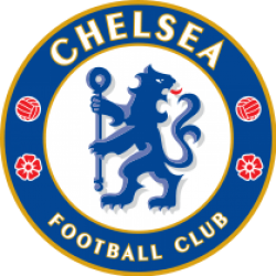
Since the club's foundation, Chelsea have had four main crests, though all underwent minor variations. In 1905, Chelsea adopted as their first crest the image of a Chelsea pensioner, which contributed to the "pensioner" nickname, and remained for the next half-century, though it never appeared on the shirts. As part of Ted Drake's modernisation of the club from 1952 onwards, he insisted that the pensioner badge be removed from the match day programme to change the club's image and that a new crest be adopted. As a stop-gap, a temporary emblem comprising simply the initials C.F.C. was adopted for one year. In 1953, Chelsea's crest was changed to an upright blue lion looking backwards and holding a staff, which was to endure for the next three decades. This crest was based on elements in the coat of arms of the Metropolitan Borough of Chelsea with the "lion rampant regardant" taken from the arms of then club president Viscount Chelsea and the staff from the Abbots of Westminster, former
In 1986, with Ken Bates now owner of the club, Chelsea's crest was changed again as part of another attempt to modernise and to capitalise on new marketing opportunities. The new badge featured a more naturalistic non-heraldic lion, in white and not blue, standing over the C.F.C. initials. It lasted for the next 19 years, with some modifications such as the use of different colours, including red from 1987 to 1995, and yellow from 1995 until 1999, before the white returned. With the new ownership of Roman Abramovich, and the club's centenary approaching, combined with demands from fans for the popular 1950s badge to be restored, it was decided that the crest should be changed again in 2005. The new crest was officially adopted for the start of the 2005–06 season and marked a return to the older design, used from 1953 to 1986, featuring a blue heraldic lion holding a staff. For the centenary season this was accompanied by the words '100 YEARS' and 'CENTENARY 2005–2006' on the top and bottom of the crest respectively.
- 690 Views
Graphical characteristics:
Asymmetric, Closed shape, Colorful, Contains both straight and curved lines, Has no crossing lines.
Category: Sports symbols.
More symbols in Sports symbols:
Symbols team logos and popular crests used in all kind of sports. read more »
Citation
Use the citation below to add this symbol to your bibliography:
Style:MLAChicagoAPA
"Chelsea F.C.." Symbols.com. STANDS4 LLC, 2024. Web. 26 Jul 2024. <https://www.symbols.com/symbol/chelsea-f.c.>.



Have a discussion about Chelsea F.C. with the community:
Report Comment
We're doing our best to make sure our content is useful, accurate and safe.
If by any chance you spot an inappropriate comment while navigating through our website please use this form to let us know, and we'll take care of it shortly.
Attachment
You need to be logged in to favorite.
Log In