What's the meaning of the Brisbane Broncos Logo »
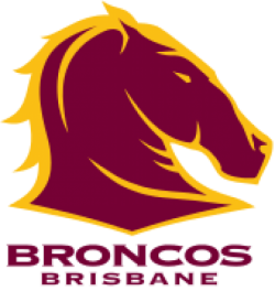
Brisbane Broncos Logo
This page is about the meaning, origin and characteristic of the symbol, emblem, seal, sign, logo or flag: Brisbane Broncos Logo.

The Brisbane Broncos are an Australian professional rugby league football club based in the city of Brisbane, the capital of the state of Queensland. Founded in 1987, the Broncos play in Australasia's elite competition, the National Rugby League (NRL) premiership. They have won six premierships and two World Club Challenges. The Broncos have achieved four minor premierships during their 27 years in competition, making them the League's most successful club over the past two decades. The Broncos have never been lower than 12th place on the NRL ladder, making them the only team to have not been bottom placed in their history. Until 2015 Brisbane had never been defeated in a grand final, and between 1991 and 2009 they never failed to qualify for the finals. They are the most successful club since the National Rugby League began in 1998, winning a record three premierships in this era. They are also one of the most successful clubs in the history of rugby league, having won 63% of their ga
It had originally been planned for the Brisbane Broncos to adopt a logo incorporating both a kangaroo and a stylised "Q" which had been featured in the logo for the Queensland Rugby League for many years. However, with the Australian national rugby league team also known as the Kangaroos, this was deemed inappropriate and conflicting. The state flower the Cooktown Orchid and the Poinsettia which had long been used by Brisbane representative teams in the Bulimba Cup and midweek knockout competitions was also ruled out, along with other Australian animals such as the brumby, possum, galah and the kookaburra, which was used on Brisbane's Kookaburra Queen paddleships.
Having wanted to continue with the use of alliteration for local sporting teams such as the Brisbane Bullets and Brisbane Bears, the club's directors eventually decided on the nickname Broncos. The Australian newspaper has described the name as "Mystifyingly American".
The original club logo was first featured in the Broncos' inaugural season in the premiership in 1988 and was used until 1999. It used a mostly gold colour scheme, in line with the predominant colour on the team jerseys. In 2000, the club adopted a new logo with a more maroon design, which was much closer to the traditional colour associated with Queensland rugby league and Queensland sport in general.This design continues to be used to date.
- 875 Views
Graphical characteristics:
Asymmetric, Closed shape, Colorful, Contains curved lines, Has no crossing lines.
Category: Sports symbols.
Brisbane Broncos Logo is part of the National Rugby League group.
More symbols in National Rugby League:
The National Rugby League (NRL) is the top league of professional rugby league clubs in Australasia. Run by the Australian Rugby League Commission, the NRL's main competition is known as the Tel… read more »
More symbols in Sports symbols:
Symbols team logos and popular crests used in all kind of sports. read more »
Citation
Use the citation below to add this symbol to your bibliography:
Style:MLAChicagoAPA
"Brisbane Broncos Logo." Symbols.com. STANDS4 LLC, 2024. Web. 26 Jul 2024. <https://www.symbols.com/symbol/brisbane-broncos-logo>.



Have a discussion about Brisbane Broncos Logo with the community:
Report Comment
We're doing our best to make sure our content is useful, accurate and safe.
If by any chance you spot an inappropriate comment while navigating through our website please use this form to let us know, and we'll take care of it shortly.
Attachment
You need to be logged in to favorite.
Log In