What's the meaning of the Seattle Sounders FC Logo »
Seattle Sounders FC Logo
This page is about the meaning, origin and characteristic of the symbol, emblem, seal, sign, logo or flag: Seattle Sounders FC Logo.
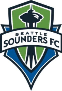
Seattle Sounders FC is an American professional soccer club based in Seattle, Washington. The Sounders compete as a member of the Western Conference of Major League Soccer (MLS). The club was established on November 13, 2007, and began play in 2009 as an MLS expansion team. The Sounders are the third Seattle soccer club to share the Sounders name being part of a legacy which traces back to the original team of the NASL in 1974.
The club's majority owner is Adrian Hanauer,and its minority owners are Joe Roth, Paul Allen and Drew Carey. Former USL Sounders coach and assistant coach Brian Schmetzer took over as interim head coach in July 2016 after the departure of Sigi Schmid; Schmetzer was made permanent head coach in November. The Sounders play their home matches at CenturyLink Field. Along with several organized groups, a 53-member marching band called 'Sound Wave' supports the club at each home match. Seattle competes with rival MLS clubs Portland and Vancouver for the Cascadia Cup.
The badge design resembles a heraldic shield, and consists of two layers which represent "the partnership between the ownership, the community, the players and the fans." The logo incorporates the Space Needle, an internationally recognized Seattle landmark. The official team colors are Sounder Blue, signifying the waters of the Puget Sound; Rave Green, representing the forests of the Pacific Northwest; and Cascade Shale, representing the Cascade Range to the east of Seattle.Fans chose a name for the team in an online poll held between March 27 and 31, 2008. The initial list of possibilities – Seattle FC, Seattle Republic and Seattle Alliance – deliberately did not include Seattle Sounders in order to provide a "fresh start." Despite the names having been selected through fan research and internal committees, the omission of the traditional Sounders name embittered many in the Seattle community. In response to the backlash, the team added a fourth "write-in" option for the team name, allowing for any name to be suggested on the ballot. Of the more than 14,500 votes received in choosing the new team name, 49% of the votes included some form of the name "Sounders". Upon announcing the name of the club, Hanauer acknowledged the significance of keeping with tradition: "The team playing at the highest level in our region has always been called Sounders. Starting with the NASL and then the USL 1st Division, we now have the chance to create a separate and distinct identity with the new MLS team."
- 969 Views
Graphical characteristics:
Asymmetric, Closed shape, Colorful, Contains curved lines, Has crossing lines.
Category: Sports symbols.
Seattle Sounders FC Logo is part of the Major League Soccer group.
More symbols in Major League Soccer:
Major League Soccer (MLS) is a men's professional soccer league, sanctioned by U.S. Soccer, that represents the sport's highest level in both the United States and Canada. MLS constitutes o… read more »
More symbols in Sports symbols:
Symbols team logos and popular crests used in all kind of sports. read more »
Citation
Use the citation below to add this symbol to your bibliography:
Style:MLAChicagoAPA
"Seattle Sounders FC Logo." Symbols.com. STANDS4 LLC, 2024. Web. 16 Apr. 2024. <https://www.symbols.com/symbol/seattle-sounders-fc-logo>.



Have a discussion about Seattle Sounders FC Logo with the community:
Report Comment
We're doing our best to make sure our content is useful, accurate and safe.
If by any chance you spot an inappropriate comment while navigating through our website please use this form to let us know, and we'll take care of it shortly.
Attachment
You need to be logged in to favorite.
Log In