What's the meaning of the Milwaukee Brewers Logo »
Milwaukee Brewers Logo
This page is about the meaning, origin and characteristic of the symbol, emblem, seal, sign, logo or flag: Milwaukee Brewers Logo.
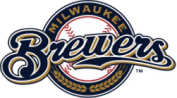
The first Brewers uniforms were "hand-me-downs" from the Seattle Pilots. Because the move to Milwaukee received final approval less than a week before the start of the season, there was no time to order new uniforms. Selig had originally planned to change the Brewers' colors to navy blue and red in honor of the minor league American Association's Milwaukee Brewers, but was forced to simply remove the Seattle markings from the Pilots' blue-and-gold uniforms and sew "BREWERS" on the front. However, the outline of the Pilots' logo remained visible. The uniforms had unique striping on the sleeves left over from the Pilots days. The cap was an updated version of the Milwaukee Braves cap in blue and yellow. Ultimately, it was decided to keep blue and gold as the team colors, and they have remained so ever since.
The Brewers finally got their own flannel design in 1971. This design was essentially the same as the one used in 1970, but with blue and yellow piping on the sleeves and collar. In
Before the 2000 season, to coincide with the anticipated opening of Miller Park, the Brewers changed their uniforms again. The block letters on the front were replaced with "Brewers" in a flowing script, and green was removed as the third color. The cap logo was a script "M", similar in style to the Miller logo, with a head of barley underlining it, symbolizing Milwaukee's beer-making industry. The home uniforms also featured a patch on the left sleeve consisting of the cap logo with a gold outline of the state of Wisconsin behind it, showing the Brewers statewide appeal. The road uniforms were grey and featured the same script "Brewers" on the front, with a simple patch on the left sleeve bearing a script "Milwaukee". There was also an alternate navy blue jersey that had the same features as the home jersey.
Although the uniforms were supposed to debut with the opening of Miller Park, the Big Blue crane collapse in July 1999, which cost the lives of three workers and caused damage to the first base side of the stadium, delayed the opening of Miller Park for one year, so the uniforms actually debuted at Milwaukee County Stadium in the ballpark's final year.
In 2006, the Brewers introduced Retro Sundays, when the Brewers would wear uniforms featuring the "ball-in-glove" logo. The uniforms are similar to the uniforms worn from 1978 to 1989, but with some modern modifications, such as the uniforms being button-up instead of pullover, displaying players' last names on the backs of the jerseys, and a "ball-in-glove" logo patch on the left sleeve. In 2007, the Retro day was changed from Sunday to Friday, though they may also be worn outside of those days if a starting pitcher chooses the retro uniforms to wear during his start. In 2010, the Brewers debuted a new alternate road jersey which, like the other alternate jersey, is navy blue, but bears a script "Milwaukee" on the front. In 2013, a gold alternate jersey with "Brewers" on the front was introduced, as well.
During the off-season before the 2013 season, the Brewers allowed fans to design their own Milwaukee Brewers uniforms. Three finalists were chosen, which fans were given the opportunity to vote for their favorite through the Brewers website. The winning uniform was designed by Ben Peters of Richfield, Minnesota, and was worn by the Brewers for two spring training games.
In 2016, the Brewers replaced their road navy and home gold alternates with a new navy alternate jersey. The uniform is similar to the previous road navy alternate but with yellow replacing gold as the trim color, and will be paired with a navy cap featuring the "ball-and-glove" logo. The navy road alternate has been worn far more often in 2016 than the official gray road jersey.
- 1,036 Views
Graphical characteristics:
Asymmetric, Closed shape, Colorful, Contains curved lines, Has crossing lines.
Category: Sports symbols.
Milwaukee Brewers Logo is part of the Major League Baseball group.
More symbols in Major League Baseball:
Major League Baseball (MLB) is a professional baseball organization, the oldest of the four major professional sports leagues in the United States and Canada. A total of 30 teams now play in the Amer… read more »
More symbols in Sports symbols:
Symbols team logos and popular crests used in all kind of sports. read more »
Citation
Use the citation below to add this symbol to your bibliography:
Style:MLAChicagoAPA
"Milwaukee Brewers Logo." Symbols.com. STANDS4 LLC, 2024. Web. 24 Apr. 2024. <https://www.symbols.com/symbol/milwaukee-brewers-logo>.


Have a discussion about Milwaukee Brewers Logo with the community:
Report Comment
We're doing our best to make sure our content is useful, accurate and safe.
If by any chance you spot an inappropriate comment while navigating through our website please use this form to let us know, and we'll take care of it shortly.
Attachment
You need to be logged in to favorite.
Log In