What's the meaning of the Renault Symbo »
Renault Symbo
This page is about the meaning, origin and characteristic of the symbol, emblem, seal, sign, logo or flag: Renault Symbo.
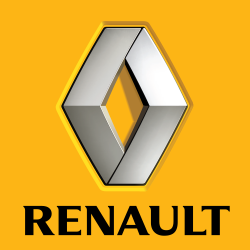
The first badge of Renault was introduced in 1900 and consisted in Renault brothers' intertwined initials. When the company started mass production in 1906, it adopted a gear-shaped logo with a car inside it. After the World War I the company used a special logo depicting a FT-17 tank. In 1923 it introduced a new circle-shaped badge, which was replaced by the today most widely known "diamond" in 1925.
The Renault diamond logo has been through many iterations since it was first used. To modernize its image, Renault asked Victor Vasarely to design its new logo in 1972. Vasarely had already worked in the advertising world and he placed his graphic talents at the service of the brand. The transformed logo maintained the diamond shape but gained cleaner, more dynamic and angular lines. A seventies design that has since been revised to reflect the new more rounded lines of the brand’s styling cues. The current diamond badge has been in use since 1992, though the Renault brand logo for web and print use was updated two times since then. In 2004 was incorporated a more realistic badge representation inside a yellow square with the word "Renault" in Renault Identité typeface besides it. In 2007, Renault commissioned to Saguez & Partners a new redesign. In this new version, currently in use, the word "Renault" was included inside the yellow square.
The yellow associated with the company appeared initially in the diamond badge of 1946, when Renault was nationalised.
Both the Renault logo and its documentation (technical as well as commercial) historically used a specially designed typeface called Renault MN, developed by British firm Wolff Olins. This type family is said to have been designed not for prestige reasons, but mainly to save costs at a time where the use of typefaces was more costly than it is now. In 2004, French typeface designer Jean-François Porchez was commissioned to design a replacement. This was shown in October of that year and is called Renault Identité.
Since 2007, as part of the Saguez & Partners revamp of Renault's visual image, all the graphic advertising make use of the Helvetica Neue Condensed typeface.
- 634 Views
Graphical characteristics:
Asymmetric, Closed shape, Colorful, Contains both straight and curved lines, Has no crossing lines.
Category: Corporate Brands.
Renault Symbo is part of the Car Symbols group.
More symbols in Car Symbols:
Car manufactures logos and symbols and their meaning from all over the world. Find out what's the origin of your favorite automobile brand symbol. read more »

More symbols in Corporate Brands:
Just as a nation's flag expresses the distinct identity of a country, so, too, a logotype — typically a symbol or letters — helps to establish the name and define the character of a corporation. Effe… read more »
Citation
Use the citation below to add this symbol to your bibliography:
Style:MLAChicagoAPA
"Renault Symbo." Symbols.com. STANDS4 LLC, 2024. Web. 18 Apr. 2024. <https://www.symbols.com/symbol/renault-symbo>.









Have a discussion about Renault Symbo with the community:
Report Comment
We're doing our best to make sure our content is useful, accurate and safe.
If by any chance you spot an inappropriate comment while navigating through our website please use this form to let us know, and we'll take care of it shortly.
Attachment
You need to be logged in to favorite.
Log In